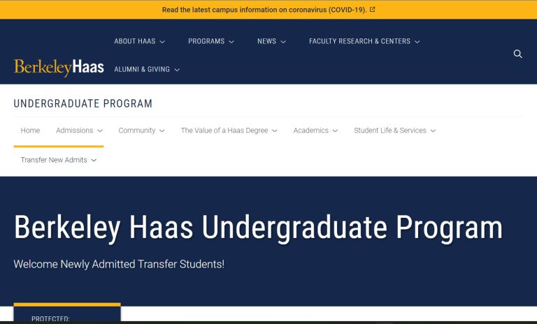
Now: Fix the issue ASAP
When the page with Inner Menu is scrolled up and Inner Menu becomes stocky, the highlight bar (yellow one) got too close to the Inner Menu options.
Left screenshot has wider space between yellow bar and menu options than the Right screenshot
Left page: Postgraduate DAOM Catalog
Right page: Registration For Online CEU
Left screenshot has wider space between yellow bar and menu options than the Right screenshot
Reference page:
Transfer New Admits
Reduce the width of browser window till you see the 2nd line shows up.

4 thoughts on “Inner Menu: Highlight bar too close to the Inner Menu options”
Fix the issue ASAP
Done, please check and let us know if any changes.
Compare these two pages and you can find out the difference.
Set the space on the Right page the same as that of the Left page.
Check the URL above
Left page: Postgraduate DAOM Catalog
Right page: Registration For Online CEU
Closed