Status: Closed; Priority: N/A
This is a static content page.
Use the content from this doc
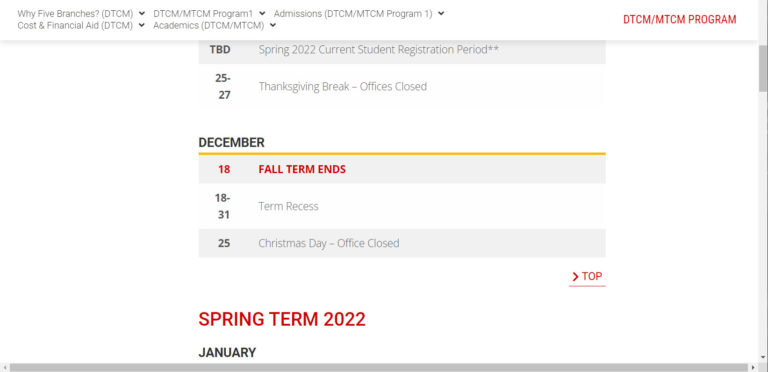
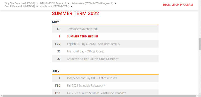
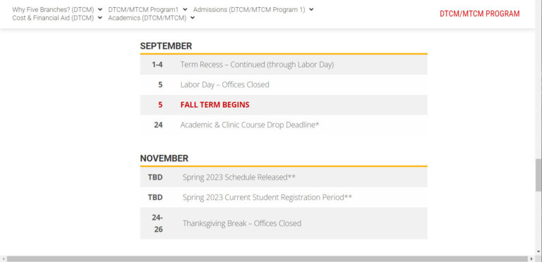
Academic calendar content
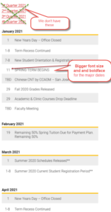
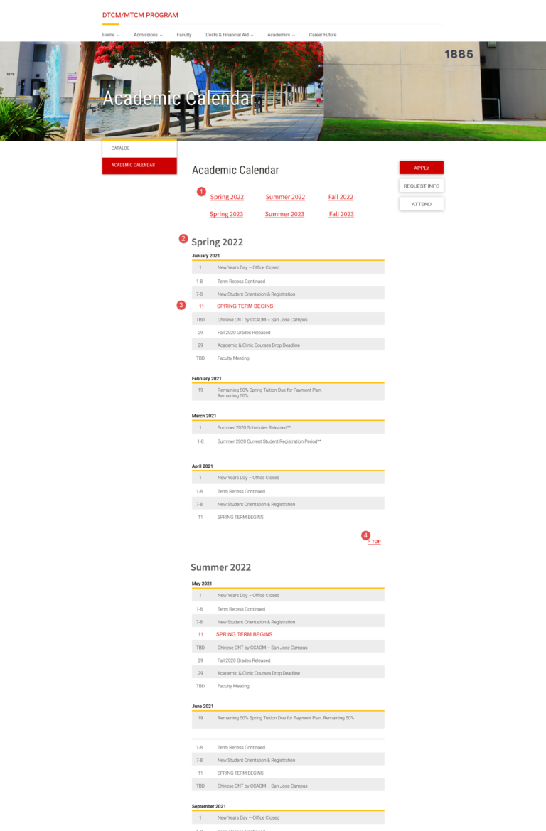
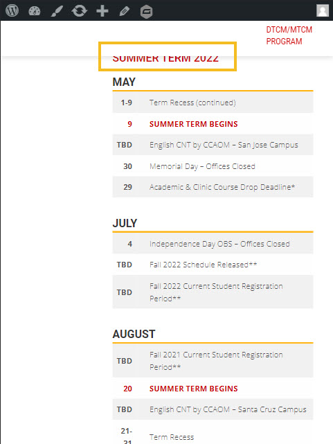
And apply the look-and-feel of the images provided below:
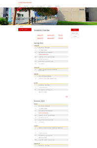
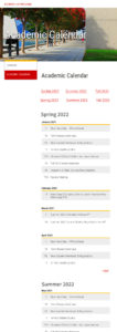
Academic Calendar – Tablet | Mobile | Reference site (TBA) <- Reference: Don’t use the presentation to the table of tablet and mobile
New Page – Old Page
To fix
Fixed:
Not to hard code all CSS settings in each and every row/cell.
Set up classes for all Table settings, including table, tr, td, etc.
That way it’ll be much easier to do fine tunings for the whole page, instead of changing each and every row/cell.
To fix: shortcuts display misaligned in mobile screen mode
<table class="wpos-academic-table" style="font-family: 'Open Sans', sans-serif; font-size: 20px;">
<tbody>
<tr class="calnder-box-cnt">
<td class="academic-right" style="text-align: right;" width="55"><strong>TBD</strong></td>
<td width="5"></td>
<td width="520">Summer 2022 Schedules Released**</td>
</tr>
<tr class="calnder-box-cnt">
<td class="academic-right" style="text-align: right;" width="55"><strong>23</strong></td>
<td width="5"></td>
<td width="520"><span style="color: #ca0000;"><strong>SPRING TERM ENDS</strong></span></td>
</tr>
<tr class="calnder-box-cnt">
<td class="academic-right" style="text-align: right;" width="55"><strong>TBD</strong></td>
<td width="5"></td>
<td width="520">Spring 2022 Commencement Ceremony</td>
</tr>
<tr class="calnder-box-cnt">
<td class="academic-right" style="text-align: right;" width="55"><strong>24-30</strong></td>
<td width="5"></td>
<td width="520">Term Recess</td>
</tr>
</tbody>
</table>
Why with a class define for a table, tr, or td, there are still style defined in the same element?
Why the style settings cannot be combined in the class assigned for that element?
That will create unnecessary workload for the editor.

15 thoughts on “CP: Academic Calendar”
Ready for development
“On Hold” – waiting for new UI
Implement with the updated UIs
in progress
Done
>>please check and let me know if any issue
Fix the issue stated above: use classes instead of hard coding in row/cell
Fix the misaligned shortcuts display on mobile screen mode
fixed
Set properly the offset to make it easier for the editor to update the anchor links
Fixed
The Anchor link on Tablet screen is not landed properly, see the screenshot above
Need to simplify CSS settings
Combine all individual style settings to the class assigned to its element if possible.
ok I will update
Fixed
Closed