Status: Closed; Priority: N/A
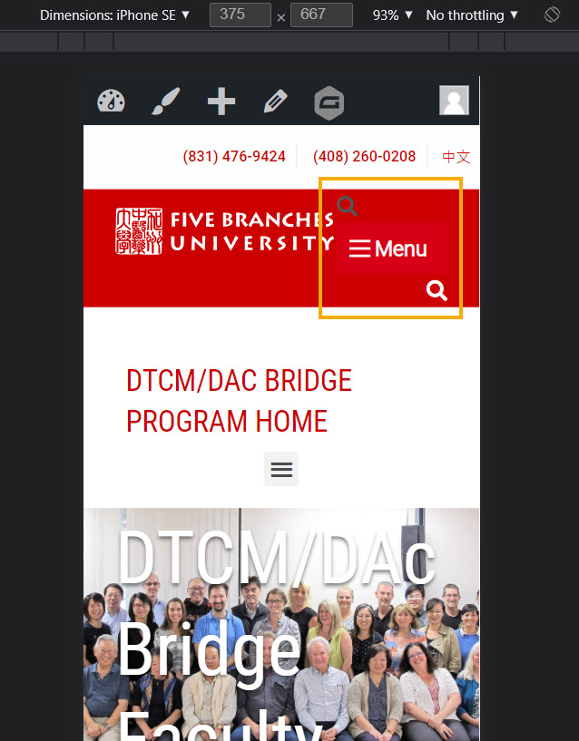
Fixed to display only one line on the mobile screen
The spec on the Preview page is
https://tracking.fivebranches.edu2/preview/header-expanded-1st-m.html
Click on any page and view it on mobile format,
example: Homepage


9 thoughts on “Top section not to wrap on mobile screen”
fix it back to one line only
>>Done
The fix created a new issue. Need to fix the new issue.
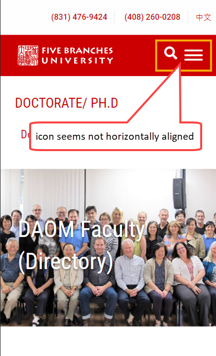
Search and Burger icons are not horizontally aligned
we have fixed please check
Search icon seems a bit higher than the burger icon
now we have fixed
Check the desktop screen if the Search icon is vertically centered.
Not to use !important whenever possible.
Please check this and let us know if anything.