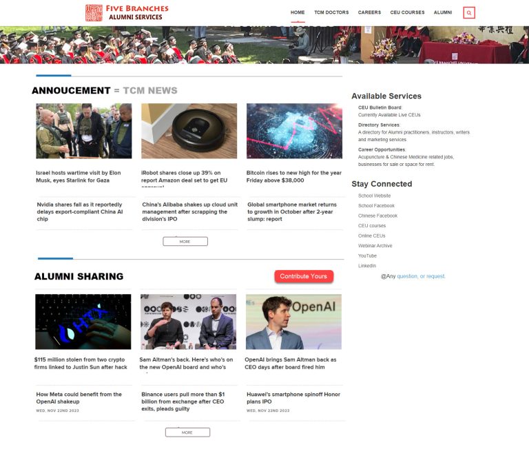
Replace current Alumni News with two sections:
- TCM Spotlights:
- Display the latest 6 posts (3 columns x 2 rows) from “TCM Spotlights” Category.
- Display the first row with the post’s Feature image. Not to display Featured image on the 2nd row.
- Create a shortcode for this section.
- More button link: TCM Spotlights page https://alumni-staging.fivebranches.edu/tcm-spotlights/
- Responsive display: Desktop 3 cols, Tablet 2 cols, Snartphone single col
- Alumni Tales:
- Display the latest 6 posts (3 columns x 2 rows) from “Story Sharing” form entries.
- Display the first row with the post’s Feature image. Display without Featured image on the 2nd row.
- Create a shortcode for this section.
- More button link: Story Sharing page
https://alumni-staging.fivebranches.edu/story-sharing/ - Display the button with “Share your story” label instead of “Contribute yours”.
- Responsive display: Desktop 3 cols, Tablet 2 cols, Snartphone single col
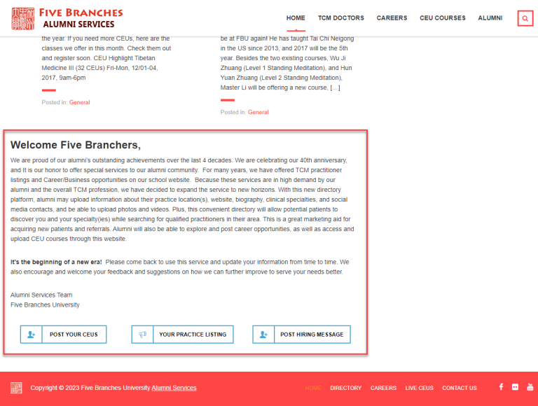
- Keep current “Welcome” section and 3 buttons section.
- Main Content : Sidebar width ratio = 2:1
- Create “Homepage Sidebar” in Widget are for editors to maintain.
- Push Sidebar below Main Content when Tablet is on its Portrait screen mode.
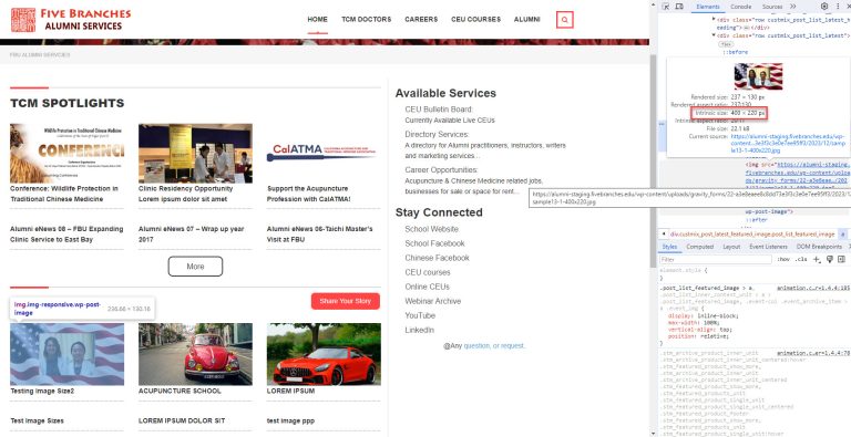
To Fix: load small size image to display for Alumni Tales
The loaded image for TCM Spotlights is acceptaable.
But the loaded image for Alumni Tales is not acceptable. It loads the full size image and resize to a smaller one. That’s a waste to web server resource.


5 thoughts on “Alumni: Homepage New Design”
Above All Points Done On Staging Site
Page URL: https://alumni-staging.fivebranches.edu/new-frontend-page/
If you have any queries or issues let me know
Check the “To Fix” items
1) Push the Sidebar below the Main Content when the Tablet is in its Portrait screen mode. (Done)
2) Display Title “as is” without truncating or limiting its length (Done)
3) Post and Story card box same height and set border in Home Page (Done)
If you have any queries or issues let me know
I have fixed an issue with “Image size”.
below are some screen shorts:
1) 400px : – https://prnt.sc/BUk-1BctkIQp
– https://prnt.sc/VXGzzn5d6Wud
2) 1024px : – https://prnt.sc/pS6tyCQapZAw
– Original image size is shown in a single page
– Image 400px size shown in New home and post by category list page
closed